Transit networks are constantly moving. Vehicles are hitting the streets, riders are boarding, and service teams are adjusting routes and schedules on the fly. Along the way, they’re collecting a mountain of operational data. But collecting data is one thing. Making it useful, fast, and understandable is another.
That’s exactly what the NAVINEO Dashboard was built to do.
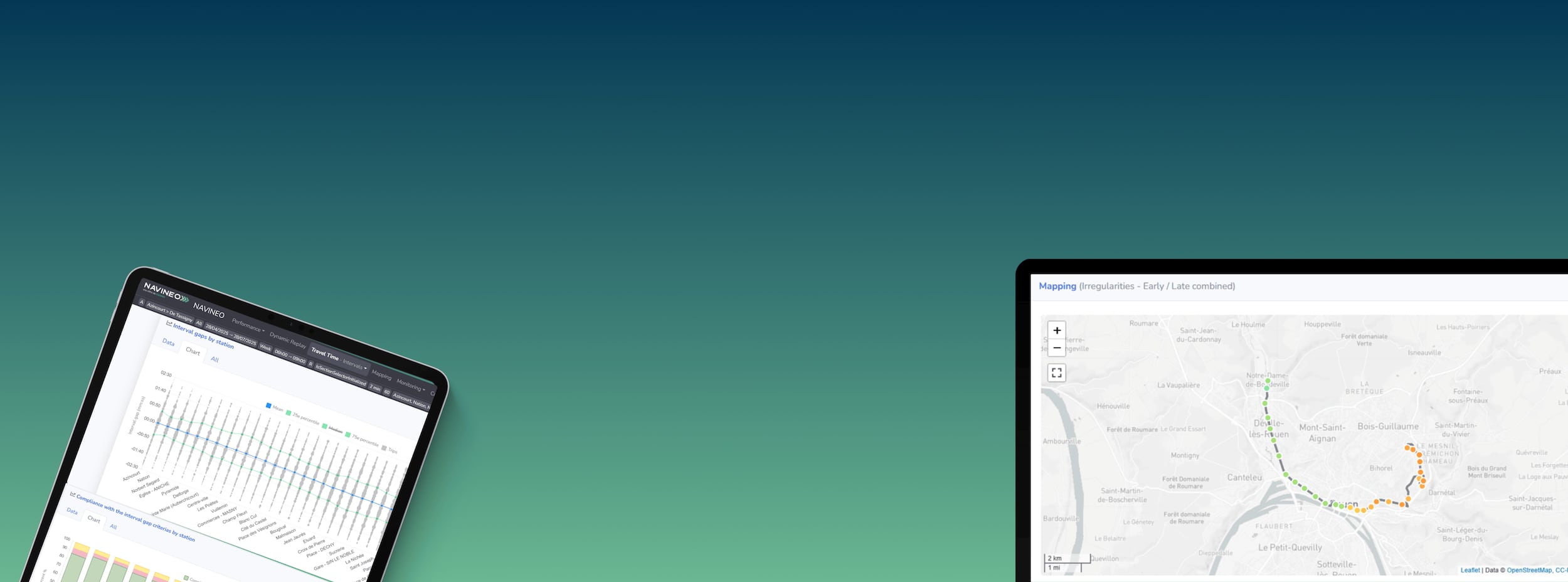
Launched this year, the NAVINEO Dashboard is a web-based platform that gives transit agencies a simple, clear view of how their network is performing. It takes all the core transit KPIs—on-time performance, passenger counts, running times, disruptions—and puts them into one smart, visual platform.
From a sea of spreadsheets to a single screen
One of the biggest challenges in public transportation is data overload. Agencies might be tracking a dozen metrics across several tools, spreadsheets, or departments. The NAVINEO Dashboard brings it all together in one place. You can log in from your desktop or phone and instantly see how your network is performing in real time.
Dispatchers can check punctuality by route or time of day. Planners can spot trends in ridership or recurring delays. Marketing or communications teams can view service performance and use that information to keep riders informed.
All of it is laid out in a way that makes sense, with visuals that help people act quickly and confidently.
Built for daily operations and long-term strategy
The NAVINEO Dashboard supports both sides of the transit house, which means those managing buses and trains day-to-day, and those thinking about how to improve service over time.
If there’s a disruption, the dashboard shows it clearly. You can look at which trips were impacted and how vehicle spacing was affected. That kind of visibility helps operators respond faster and keep passengers moving.
At the same time, planners can dig deeper into trends over days or weeks. They can look at schedule adherence and running times to understand whether certain routes need adjustment. If riders are consistently waiting too long or arriving late, the data tells that story and gives planners the insight to adjust accordingly.
A new way to look at your network
One of the most useful features of the dashboard is its map-based analysis. Isochrone maps, for example, show how far someone can travel from a specific location within a set amount of time. That helps agencies assess service coverage and identify gaps or opportunities for new routes.
You can also view real-time headway data, track vehicle spacing, and check execution rates. These numbers are decision-making tools that help agencies improve reliability and passenger satisfaction.
Designed for everyone on your team
While the dashboard was designed with operations teams in mind, it’s easy for others to use too. Its clean interface and accessible design mean that anyone—from a dispatcher to a general manager—can log in and get what they need without a training manual.
That accessibility is a big part of its value. A performance analyst might use it to create a monthly report. A communications lead might pull ridership numbers to update the public. A planning director might evaluate service changes based on punctuality trends.
Everyone is working from the same source of truth, which leads to better decisions and fewer miscommunications.
Already in use worldwide
Transit agencies around the globe are already using the NAVINEO Dashboard to simplify how they work with data. What used to take hours of manual effort can now happen in just a few clicks. That saves time, reduces errors, and gives teams the chance to focus on improving service instead of stitching together spreadsheets.
And because the dashboard works on both desktop and mobile devices, it fits into any workflow. Whether you’re in the control center or checking on the go, the information is always available.
A practical advantage in a competitive landscape
What sets NAVINEO’s dashboard apart from other transit software isn’t just the data it collects. It’s how that data is visualized, organized, and made usable by real teams. The platform turns performance metrics into a clear picture of what’s working and what’s not.
That helps agencies prioritize improvements, communicate more effectively with riders, and get ahead of potential service issues before they grow.
From raw data to better service
The NAVINEO Dashboard helps teams do more than monitor. It helps them understand. It provides a way to translate complex datasets into clear stories that lead to action.
Ultimately, transit agencies need tools that help them plan better, respond faster, and make decisions with confidence. The NAVINEO Dashboard is one of those tools.
If your team is swimming in data but struggling to connect the dots, this platform is built for you. It makes performance visible, simplifies reporting, and supports everyone from operations to strategy.
In a world where public transit is expected to be faster, more reliable, and more responsive than ever, having the right data at your fingertips makes all the difference.